AVT 595-Colored Pencil

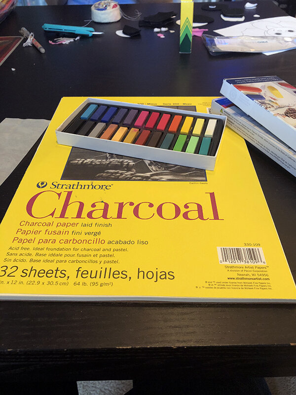
I figure beyond experimenting solely with materials for this blog, I should experiment with the format some as well.  Rather than go with my typical, free-wheeling stream of consciousness “diary” style approach, for this one, I’m attempting to be a bit more structured and methodical.  With that said, on to colored pencils!

Materials

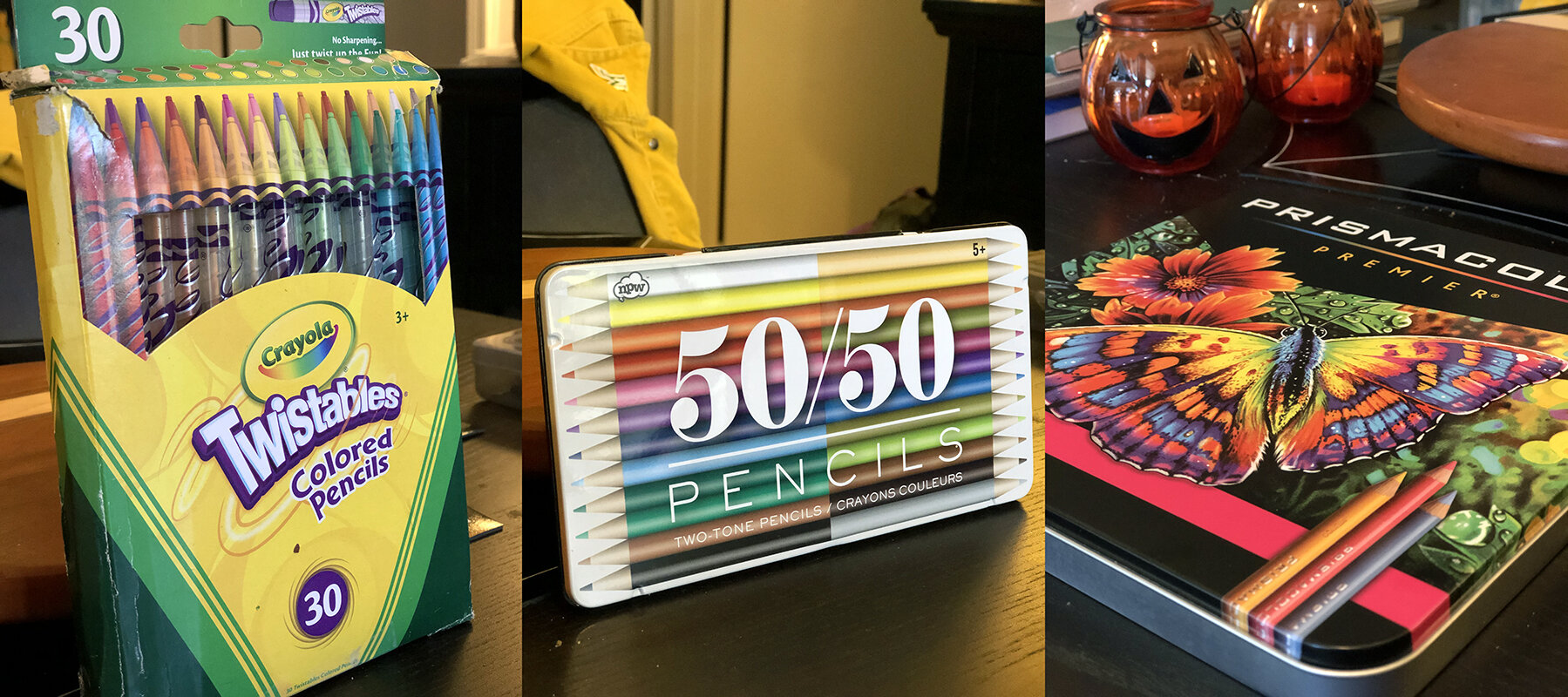
Prismacolor Premiere 48 Piece Set- $42 from Amazon

Crayola Twistables 30 Piece Set- $6 from Walmart

50/50 Colored Pencils 12 Piece Set (Double Sided, 24 Colors)- $9 from Walmart

IMG_3591.jpg

Verdict:  In my research I discovered that colored pencils are typically wax or oil based, with wax being preferred due to its smoother application and richer color.  I tried to find oil based pencils for comparison, but everything I came across, including the 3 brands I used, contained wax (combined with clay) “lead.”

Prismacolors seem to be considered the standard bearer for high quality colored pencils (and the price reflects that) and sure enough, I was impressed by the buttery smooth application of vivid color, the ease with which pressure can be varied, and the ability to draw with either the tip or the side of the pencil point.  They are fade resistant (“lightfast”) so work will remain vibrant for a long time.  If budget allows, these are a great option.

The Crayola Twistables surprised me.  They look cheap, they are cheap, and to most artists I know Crayola in general is considered more of a kid’s toy than an actual art supply.  In my tests I found the color of these twistable pencils to be just as easy to apply and nearly as rich as the Prismacolors.  This remained the case on any of the paper types I tested them on.  On the downside, they have thick, barrel shaped lead that doesn’t allow for nearly as much variation in line.  Also, the mechanical pencil bodies are color coded to match the pigment, but this information is practically useless.  By eyeballing one, at best you’ll be able to determine that it’s “some kind of blue.”  I had to make swatches for each to accurately discern what kind of value and hue they would lay down.  They are inconsistently lightfast, with some colors holding up well, while others (mostly oranges and reds) fade quite a bit over time.

The 50/50 set seems like generic, off brand junk.  The leads have a high concentration of clay vs wax, and as a result, are hard and sharp.  They are likely to gouge the paper if too much pressure is applied.  Lightfastness is not much of a consideration, as their color is washed out and weak to begin with.  As a very minor compliment, they are double sided, which means you can carry twice the number of weak colors in half the amount of space.  Unless storage space is a concern, or these are to be used as a cheap, disposable distraction on a car trip or something, I’d avoid these things.

In a classroom context, where materials are to be used by students as opposed to professional artists, I’d give my overall nod to the Crayola Twistable pencils.  They are of competitively high quality to Prismacolors for a fraction of the cost.

Safety & Age Appropriateness

The packaging for all 3 brands lists them as ACMI (Art & Creative Materials Institute) certified as non-toxic, with the exception of the gold Prismacolor pencil, which is singled out for containing copper.  Crayola has a warning against use by children under 36 months old, but this is due to the small parts contained in the pencil mechanism as opposed to a chemical hazard.  Otherwise, these materials could be safely used by students of any age.

They are similarly appropriate for any age in terms of technique.  Colored pencils are versatile, capable of a wide range of marks and able to draw just as easily in line or swaths of color.  Advanced students can attempt gradations of color using cross hatching, burnishing, or by introducing a solvent.  As a medium, they are flexible and easily scaled to the sophistication level of the class.

Experimentation

As mentioned in previous blog entries, I’m very comfortable with drawing, but not so comfortable with color.  With any new medium, I always start off by testing out what types of marks I can make, different ways of manipulating the tool, and how these results are affected by different types of paper.  For colored pencils, I did these tests on Strathmore 80lb Toned Gray, Canson 98lb Mix Media, and Canson 140lb Watercolor pads. 

IMG_3599.jpg
IMG_3597.jpg

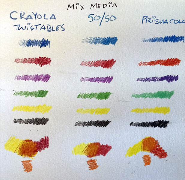
I liked the texture provided by the watercolor paper, but overall found it to be harder to apply the pencil.  The mix media was a little smoother, but I found the stark white background to be pretty harsh.  Ultimately, the toned gray was my preference due to how smoothly the pencil went on and the way it calmed the colors down a bit. 

One of the primary techniques used in colored pencil work is blending.  Most reviews of materials I read focused on the ease of blending as a primary concern.  I never really got this to work well for me, with any of the brands I tried or on any surface.  I tried applying more or less pressure, using circular motions, cross hatching, burnishing, the results were always muddy to my eye.  After several messy doodles trying to force my color blending, in the end, I found that using limited hatch marks of one color over another gave me the best results.

IMG_3601.jpg

In an attempt to speed up my learning process, I went to YouTube looking for assistance.  I consulted several videos, but found this general colored pencil overview by Kirsty Partridge to be the most informative:

Even with her tips in mind, my blending didn’t improve dramatically.  My assumption is this is something that comes with practice.  I wish I’d watched this before buying my supplies, as some of her techniques, like painting over your marks with solvent, are something I never would have thought of but would love to try. [Side note: Certain solvents are toxic!]  I did take a shot at coloring over lines drawn with the white pencil, and lines scratched in with a scalpel, after seeing this in her demonstration.

IMG_3598.jpg

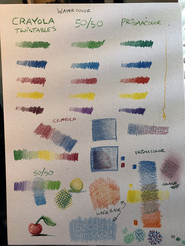
This yields interesting marks that are good to keep in the mental bag of tricks, but don’t seem immediately applicable to the type of work I was trying to do.

Overall Results

I’ve enjoyed expanding my tool set through these blog entries, and like charcoal and chalk pastels before them find colored pencils to be something I’d like to invest more time into learning.  They are a very “pick up and play” artmaking material.  Little-to-no prep work is required and clean up is a simple act of putting your paper and pencils away.  The pencils themselves are responsive, rich and versatile, and allow me to explore color as easily as chalk pastels but without leaving a cloud of rainbow colored dust in my wake.  In terms of intimidation factor and technique they have a low barrier for entry but unlimited potential to expand alongside one’s knowledge of color theory.

The only possible weakness I can think of are that they are difficult to blend (for me, anyway), there is a large disparity in quality between brands, and expensive pencils can be eaten away quickly by an unsuitable sharpener.  Minor quibbles aside, I am unreservedly enthusiastic about colored pencils as an art medium for students of all ages.

Lastly, I feel pretty confident that they are something I could teach comfortably.  I encountered a few speed bumps with regards to my own proficiency at blending, but I know how they work and what is achievable with them.  My own personal work with these things may not be amazing, but I can successfully impart the concepts to students and facilitate their learning.

AVT 595-Chalk Pastel (Soft)

I think this may be the first time in my life I’ve ever touched pastels.  While I was excited to give them a try, I’ll cop to being a little nervous about working in yet another medium that tends to eschew the use of lines, and to work in solid color.  As an undergraduate drawing major, most of the materials with which I’m most familiar are grayscale: Graphite, pen and ink, inkwash, charcoal…we did use conte crayons occasionally, but even those were limited to a 3 color palette.  For whatever reason, in my drawing program color was treated like your uncle’s drinking problem at Thanksgiving: We all know it’s a thing, but we’re trying our best not to acknowledge it.

Having never used these before, the first thing I did was head to Michaels to pick up a Faber-Castell box of 24 soft pastels.  This is perhaps more colors than were necessary for a beginner, but was the smallest set of “studio quality” materials in stock (the lower quality “student grade” was available in a 12 pack).  They rang up at $19.99, but since this was Michaels, expect to pay half that anywhere else.  I also went with a 32 sheet, 9x12” Strathmore Charcoal paper pad simply because it said “Ideal foundation for pastel” on the cover.  The paper was $15, but again, Michaels.  Buying from them is like paying the Canadian rate they used to list beneath the “real price” on books and magazines.  If you choose to buy your supplies from Michaels, consider the mark up an “idiot tax.” 

IMG_3530.jpg

Supplies in hand, it was time to go about figuring out how these things work.  Soft pastels feel very similar in texture and consistency to vine charcoal.  Just kind of making marks willy-nilly, varying pressure, and rubbing the results with various blending instruments worked well for me in that medium, so I replicated the same tests this go round to similar results.  I was immediately struck by how malleable the marks were.  It’s quite easy to go from soft and delicate lines, to hard, intense areas of color with just a little firmness of hand.  A kneaded eraser can pick up a good 80-90% of the pigment in most applications.  Blending was silky smooth with a tortillon, a paper towel, a Q-tip, or a finger.  Simply laying down 2 colors next to each other and swiping between them with a single pass of an index finger creates a smooth, pleasing gradient.

IMG_3539.jpg
IMG_3537.jpg

This ease of blending can work as a double-edged sword.  With charcoal, having residue on your finger (or tool) before blending offers no real consequence.  In a color medium, being careless about cleaning can quickly lead to cross-contamination and muddied colors, something that plagued my final drawing even though I was aware of the issue at that point.

Also, to a certain degree, working with soft pastels is like trying to draw with Pixie Sticks.  The powder just kind of sits on the surface, if a butterfly flaps it’s wings within a hundred feet of you your drawing is liable to blow away.  Keep in mind that chalk powder WILL be everywhere when planning a workspace.

IMG_3548.jpg

The final drawing was just a matter of combining what I’d learned through experimentation and applying it to a larger project.  For my subject matter, when in doubt, draw a piece of fruit.  There’s not much to say here, as it was a standard process of blocking in a shape with pencil, and then laying in color.  Aware that my color knowledge was an obvious shortcoming, I stuck with our Exploring Studio Materials textbook’s advice and limited the number of hues at my disposal.  I think I kept it to just the primaries, plus green, and tried to create any other colors I needed through blending.

IMG_3544.jpg
IMG_3545.jpg
IMG_3547.jpg

One thing worth noting that I wish I’d discovered earlier is that chalk pastel seems to work best with a light to dark approach, as opposed to the dark to light method I used.  It was late in the process when I discovered that the lighter yellows and white highlights I tried to apply in the final stages just weren’t showing up very well.  As mentioned earlier, I did a poor job remembering to clean my finger tips between blending passes, significantly muddying up my colors.

All in all, this was a fun experiment, and chalk pastels are definitely something I’d like to get more familiar with.  It strikes me as a lower stakes entry point into painting, something I’m also inexperienced with (a seemingly running theme of these blog entries) and a quick and easy way to begin building a knowledge of color theory.  I think I can only improve from here, and I’m excited to try.

IMG_3568.jpg

Some notes about usage in a classroom context:

-Fixatiff is necessary to bind the final drawing.  As always, take that outside or have an adult do it.

-While similar to charcoal in terms of tactile fun, methodology of use and safety of materials, I actually think chalk pastels can skew much younger.  They’re appropriate for practically any age group.  The final product will appear much more refined if created by a person thinking in terms of volume, light and shadow, but as this is a color medium, even abstract markings can create a vibrant, engaging piece.  With charcoal, smearing powder all over a canvas will basically lead to a solid black mess.  A pictorial representation of the infinite void.  Color pastels are a lot more forgiving, and can be approached by very young children as powdery, easily smudged crayons. 

AVT 595-Charcoal

Charcoal, my old nemesis!  As someone who primarily draws in line, the emphasis on light, shadow and blocks of value required for working in charcoal has always been especially challenging for me.  I’ve also historically struggled with the physical application of the medium.  I just flat out don’t know how to manipulate it well.  I tend to go too dark, too soon, I have terrible accuracy with thick sticks of vine or compressed charcoal, I leave smudges and fingerprints everywhere despite my best efforts, and I seem incapable of making smooth gradations in tone.  It’s not for lack of trying.  I own several books on charcoal drawing, have watched tutorial videos etc.  At the end of the day, I feel like a righthanded musician trying to switch to a lefthanded guitar.  I understand how it works, conceptually, but my hands are too awkward, clumsy and uncoordinated to do what I want them to do.  I feel pretty confident that I could teach how to draw with charcoal, as long as I could skirt having to demonstrate the techniques with virtuosity.  I could ghost write a book on the subject, how about that?

All of that said, I really like the look of charcoal work. I love the smokey, ethereal atmosphere that can be achieved when used well. I appreciate its malleability, it’s forgiving nature, and that it forces the use of a different way of thinking. It’s something I’d love to get better at, which is why I chose it as my first medium to experiment with.

Rustling through my box of art supplies turned up sticks of vine and compressed charcoal (both thick and thin) as well as Derwent and General’s charcoal pencils in light, medium, soft and white.  All of these materials are dirt cheap, though the packaging touts their “finest quality!” so I guess they’re fit for gods and kings.  Charcoal drawing necessitates a lot of blending, so I armed myself with multiple types of tortillon, a paintbrush, Q-tips, paper towels and fat fingers.  Again, super cheap, but also, the best money can buy.  For erasing (but really, another method of drawing!) I grabbed a kneaded and retractable stick eraser.

IMG_3458.jpg

As I hadn’t touched any of this stuff in a few years, the first thing I did was go into my Canson XL mixed media sketchbook and start playing around, trying to remind myself of what each of these things do, how they work together, and the types of marks you can make with them.  I did several pages like this, laying down marks, varying the pressure, rubbing over them with other tools and just generally testing what was possible.  The short answer?  Everything.  There are approximately 1 trillion different effects that can be achieved with charcoal.  My Canson sketchbook has some tooth to it.  I really like the textured marks that come naturally on this kind of paper.

IMG_3461.jpg

For the actual drawing, I moved to a Strathmore Toned Gray drawing pad.  I use these things for everything, as they provide a built in midtone to use as a starting point, and work well with both dark and light mediums.  Bonus, they’re cheap! 

IMG_3467.jpg

I pulled up a stock photo of a head to use as a reference for general feature placement and a lighting set up, but didn’t concern myself too much with a likeness, for down that path, madness awaits.  First I did a rough block in of structure, proportion, and some of the darker areas.

IMG_3469.jpg

From there, it was mostly about laying down marks and manipulating them with my various blending tools, trying to get some smooth tonal shifts while hopefully retaining some of the handmade feel.  I don’t like things to look too smooth, and try my best to retain some texture, stray lines, happy accidents and evidence that this is a drawing.  Personally, I have no interest at all in photorealism.  I also tried to use the erasers as a drawing tool as much as possible, blocking in areas of tone and then cutting away at them with the kneaded and stick erasers.

IMG_3473.jpg

Then it was just about refinement.  Honestly speaking, I’d say over refinement.  I think I pushed this past the point where I should have stopped, noodling away at little areas that don’t make much of an impact at the expense of stepping back and looking at the drawing as a whole.  The proportions are a little weird in places, some of the planar edges of the face way too hard, and I went overboard with the white charcoal in the final stretch.  I made use of every tool at my disposal to some degree, but by the end, found myself most comfortable working with just vine charcoal, my finger for blending, and my erasers.  I definitely grew more comfortable as I went, and learned a lot that I would apply from the get go in my next attempt.  I’m not hanging this on my parent’s fridge by any means, but all said, probably one of my more successful charcoal drawings.  And hey, I had fun doing it, and isn’t that what really matters?

IMG_3474.jpg

Some notes about usage in a classroom context:  Fixatiff is a necessity if working heavily with loose, powdery vine charcoal but is prohibited from use by small children indoors.  Take it outside to spray, or have an adult do it after class.  The charcoal itself is relatively harmless to kids, though maybe not their clothes or your walls.  I guess it could provide a potential choking hazard, but in my experience, most non-consumable objects do if you eat them.  We still let kids have access to crayons and glue, so, this shouldn’t be any worse.  There’s no need for children to use a knife for sharpening their charcoal pencils, a regular ol’ plastic pencil sharpener will work just fine.  Knives and blades are best saved for pretentious adult artists, determined to impress people with their needlessly artisanal tools.

From a feasibility standpoint, I think charcoal can be used by students of practically any age. As a tool, it’s not that much more sophisticated than chalk or colored pencil. It has some of the simple, tactile fun inherent in something like finger paint. Due to the methodology behind it, it’s probably better suited to slightly older kids, say, 4th grade and up. To take advantage of its strengths requires artists who can think in terms of form, light and shadow as opposed to line.