AVT 667-Pastels

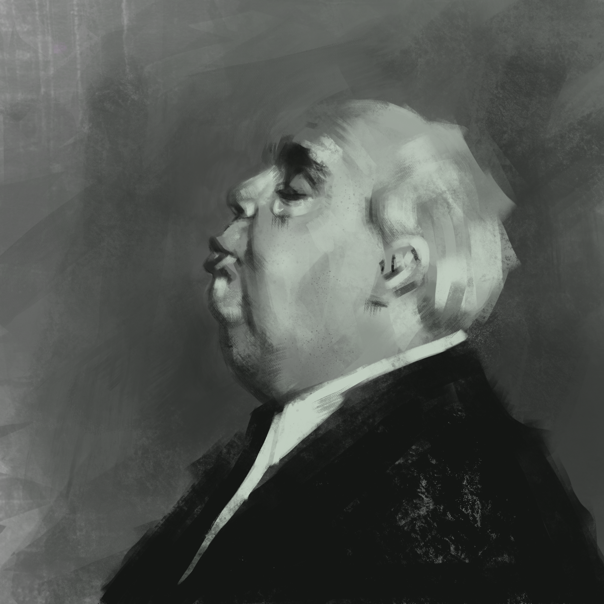
I’ve never been great with pastels.  Do you treat them like a drawing tool, or more like a painting tool?  The answer, of course, is “yes.”  Pastels seem to occupy this grey area between drawing and painting, and as such, are a good transition point for students in moving from one medium to the next.  When a fine line is needed, the edge or corner of a chalk pastel block can do the job.  If large areas of color coverage are what’s desired, turn a pastel on its side and go to town.  After pigment has been applied, it can be further manipulated with a finger, a blending stump, a rag, a cotton swab or a brush.  With a little bit of practice, intricate gradations and delicate color blending are easily achievable.  Even more so than with graphite or colored pencils, the texture of the drawing surface plays a substantial role in the final piece.  Every minute detail of the paper or canvas will show through the pigment, opening up a world of expressive opportunities.   

Of note, chalk pastel takes the form of a fine powder, liable to explode into the air in a technicolor mist if someone so much as sneezes near it.  For this reason, fixative is recommended, and with fixative come the same warnings issued previously: For adult use only, and don’t spray it in an enclosed area. 

Resources

Chalk Pastel Techniques for Beginners (Video)- https://www.youtube.com/watch?v=oj2sEXs4XZY

Covers blending, hatching and crosshatching, side strokes, layering, feathering, pointillism and basic drawing. 

Pastel Tutorial Archives- https://www.hodgepodge.me/category/hmscl/pttl/

A series of pastel tutorials intended for children. 

My in class experimentations with chalk pastels, featuring McDonald’s mascot “Grimace”, a desert island infested with bats, and Teenage Mutant Ninja Turtle Michaelangelo.  All the standard subject matter from my aesthetic…

Playing around with mark making:

AVT 667-Colored Pencils

Colored pencils fall into the same category of enthusiasm I reserved for graphite: They are versatile tools, cheap, easy to be grasped by anyone, and capable of the same wide range of expressive qualities as standard pencils with the added benefit of incorporating color.  Color and pencil are like peanut butter and chocolate, two great tastes that taste great together. 

That said, I do believe that the addition of color to the medium can be paralyzing for some artists (it was for me, for awhile).  Color is a skillset in and of itself, subject to its own rules and working methods.  Switching from a graphite pencil to a colored pencil is not a 1 to 1 translation, as now the artist must think about color harmony, temperature, saturation and a whole host of other concerns beyond just value.  For this reason, I’d recommend at least an introductory color theory lesson before bringing them into the curriculum.  Explaining primary, secondary, and complimentary colors will go a long way towards making students feel more comfortable before working with these things.  

I’d also spend some time covering the various means of combining colors with colored pencils.  This too is something I struggled with when I first started playing around with them.  Multiple colors can be used to crosshatch, stipple, layer, overlay, and create smooth gradations, but these methods aren’t always immediately obvious to novices.  If you want to get really crazy, solvents can be added into the mix causing the binding agent of the pencil to breakdown and the pigment to act almost like paint.  A color can be laid down and manipulated on the surface using solvent and a paintbrush.  Solvents can be toxic, so this method may best be reserved for older students.   

The following resources may be helpful in teaching students colored pencil blending techniques: 

“The Only Methods You’ll Ever Need for Blending Colored Pencil” Carrie L. Lewis

https://www.carrie-lewis.com/3-methods-blending-colored-pencil/ 

“8 Ways on How to Blend Colored Pencils Like a Pro” Jae Johns

https://jaejohns.com/how-to-blend-colored-pencils/

In class I tried my hand at Crayola “Color Sticks” which seem to be the halfway point between a traditional colored pencil and a pastel.  Their large, blocky, hard edged shape made them a little unwieldy for the type of line drawing I was trying to do, but I could immediately see how intuitive they’d be for a more painterly approach, and I liked the way they reacted to the textured paper.

In my sketchbooks, I almost always work in red or blue colored pencil (or blue ballpoint pen). I like the “glide” of a pencil, but with graphite, I find I tend to go too dark too early, and I leave smudges and fingerprints all over the place. Colored pencils have the same range, feel and texture of graphite, but without some of the drawbacks. These are all from my sketchbook, but I always have trouble taking good photos so apologies in advance for the image quality.

AVT 595-Digital Art (Procreate)

I had written a reflective introduction ruminating on my journey of artistic discovery through this blogging project, but when the post was done, I realized I’d actually written The Odyssey.  It was way too long and self-indulgent, so here’s the concise version:

I was going to write about Adobe Illustrator, because it’s firmly in my wheelhouse, but then decided I really like exploring unfamiliar materials.  I picked up an iPad, a stylus, and Procreate so I could try something new and see for myself what all the kids are talking about.

Same gist, give or take about 10,000 words.  Let’s get into it…

Materials & Cost

iPad Pro 12.9” 3rd Generation 64 GB (Refurbished)-$800

Apple Pencil 1st Generation-$99

Procreate App-$9.99

Paperlike Screen Protector-$35

Apple Pencil Charging Dock-$15

IMG_3611.jpg

Right off the bat, these are expensive materials.  I managed to shave about $300 off the price of the iPad by buying a refurbished model, but still, when you factor in necessary accessories like screen protectors and a charging station for the pencil (more on these later) I’m in the hole for at least $1,000.  We’re in a whole other universe of cost than choosing between Prismacolor and Crayola colored pencils.  I’m not well versed in public school budgets, but I have to imagine investing tens of thousands of dollars to outfit an entire classroom with this equipment is a pretty big ask.

Of course, “value” is a subjective term.  An iPad Pro is, essentially, a laptop computer, packed full of features far beyond what’s necessary for artmaking.  If students are to utilize this device to its maximum potential parents may not balk so much at the hefty price tag.  It’s also worth noting that in my completely anecdotal experience, a lot of kids today have one of these things already.  If that’s the case, the cost of entry is simply for the software and the Apple Pencil.  $110 isn’t nearly as intimidating a figure.

An attractive upside to the Procreate app is that it is a one time, inexpensive purchase.  This is a significant advantage over common graphics software like Adobe Photoshop or Corel Painter, which either require hundreds of dollars up front, or recurring subscription fees for access.  Having years of experience with the competition, I can state emphatically that Procreate contains virtually everything a person would want or need to create professional caliber illustration work, at a fraction of the cost.  For the price, the included feature set is downright shocking.  Additional brushes can be purchased for download, but in my opinion, the default options are so robust that adding to the library is a luxury, not a necessity.

Safety & Age Appropriateness 

“Safety” is a tricky subject with a device like an iPad.  On its surface, it’s simply a lightweight, rounded slab.  With no exposed, or even accessible, wires or electronics, it doesn’t provide threat of electrical shock.  Short of intentionally hitting someone over the head with it, it’s about as harmless as a thin, hardback textbook or a small cafeteria tray.  Where this becomes a bit of a grey area is in the fact that this is a wifi enabled, constantly connected device with a camera and a microphone.  It is quite literally a two-way window into the internet, and with that comes all of the typical dangers associated with children being online.  For that reason alone, use by younger kids should be closely supervised.

In terms of appropriateness, my gut instinct would be to say that an iPad is too complicated of an interface for small children, but my 3-year-old nephew seems to have no problem at all playing with a smartphone, so kids today are probably much more adept with technology than I am giving them credit for.  Personally, I’d still limit use to kids from around the 4th grade on up.  I’d want to ensure they had the maturity level to be respectful of how expensive these tools are.  An iPad is fairly sturdy, even more so if it’s in a protective case, but spills or a long fall to a hard surface can be fatal to a costly tablet.

The Procreate app is very intuitive.  The brush button makes the stylus paint like a brush, the eraser button makes it erase, and so on.  There are some really deep options with regards to layers, image exporting and file management for those who need them, but a young student can pick it up and figure out how to start creating almost instantly.

IMG_3614.jpg

Application

In my opinion, far too many digital artists get caught up in fancy software tricks involving blending modes, filters, smudging and smoothing options etc. The result is that they are able to produce slick, polished looking artwork within that specific program, but are unable to replicate it anywhere else.  They don’t develop a universal skillset.  For this reason, my approach to digital art has always been to stick to the fundamentals as much as possible.  If I can’t do the same thing in real life using an analog tool, I try not to do it in the software.  This methodology guided my experimentation with Procreate.

 Happily, Procreate functions very much like traditional tools.  The Apple Pencil is pressure sensitive, allowing thicker, more opaque marks the harder it is pressed down upon.  The pixels act like paint, graphite or charcoal, in that they intermix and blend easily, or can be glazed upon each other softly.  Texture can be achieved by varying the direction of the brushstrokes.  My first couple of exercises were just about mark making, and trying to blend colors (something I had a difficult time with using chalk pastels and colored pencils).  To my relief, blending in Procreate was silky smooth as long as one is able to maintain good pressure control of the Apple Pencil.  As mentioned earlier, the available brush/media types allow for a wide range of expressive marks to be made that look and feel natural.

IMG_0044.PNG
IMG_0043.PNG

From there, I opened up a random reference image off of Pinterest and tried to paint a portrait the way I would in real life, working dark to light and mixing my colors right on the “canvas.”  It was a challenge, but more because of my skillset than the technology (I’m not the best painter).  At no point did I feel like my failures were a result of the software or tools I was using, which is the highest compliment I can pay to them.  The stylus and iPad function as naturally as a brush or pencil on canvas or paper.

IMG_0042.PNG

I wasn’t super happy with the results.  I think a potential downside to working digitally is the inclination to overwork things.  With physical media, there are restraints.  You don’t want to use up all of your expensive supplies, you have to factor in clean up time, you worry about ruining the paper/canvas or making a mess etc.  Working digitally, none of that matters.  You can carry on forever, noodling away in a futile pursuit of perfection.  For this next one, I tried to work quicker and looser, thinking about texture more than rendering and limiting myself to just 15 minutes.

IMG_0040.PNG

I liked that a lot better, at least in terms of “feeling.”  I’ve lamented my prowess with color a lot in this blog, and one of the nice things about Procreate is that if I lay a few down and they don’t work, it’s super easy to undo them or paint over them.  Again, any problems here are my own failings, which is a testament to the versatility of the software.  I don’t feel handicapped at all.  One last attempt, this time trying to be even faster and looser, not worrying about color, embracing mistakes, and trying to think more in terms of edges and shapes.

IMG_0039.PNG

This is where I think things really started to click for me, in the sense that I stopped paying analytical attention to the tools and started thinking more as an artist.  I subconsciously moved from seeing this working process as a novelty done on a multimedia device, to seeing it as an expressive medium in its own right. 

My overall thoughts on the iPad/Procreate experience are extremely positive.  Physically, it feels as intuitive as any other handheld artmaking tool.  Colors, paint and brushes behave as they would in the real world, allowing a user to easily experiment and still gain practical, transferrable knowledge.  Enough cannot be said about the convenience working on an iPad provides, in that you can take it anywhere and work any time.  Having one of these things is like having an entire art studio in the palm of your hand at any given moment.

It’s not perfect.  I found there to be a bit of a weird disconnect when drawing directly onto the iPad’s glossy screen.  The plastic nib of the Apple Pencil running along the glass surface feels too slick.  The Paperlike (brand name) screen protector is pricey, but in my eyes, worth the extra expense.  It provides some toothiness and a bit of resistance that feels much more like actual paper.

And as a purely personal nitpick, I get a little nervous about things being replaced with data.  To me, there’s something special about tangible artwork existing in the world as a unique, physical object.  Digital art doesn’t allow for one of a kind creations, but instead, as-many-as-you-want-of-a-kind reproductions.  The trade off for convenience is the loss of original work.

Notes

I feel very comfortable teaching this method of art making.  It’s so versatile it can be easily adapted to any technique or principle a teacher is trying to demonstrate.  The only limits lie in the knowledge base of the instructor, which is the same as it would be with any medium.

The Apple Pencil has a downright bizarre method of charging, in which it must be inserted into the port at the bottom of the iPad, jutting out like a flimsily attached antenna.  The Pencil doesn’t sit flush with the ground, making it far, far too easy to be snapped off by a child who isn’t paying attention.  I’ve almost broken it a few times myself.  For this reason, a separate docking station that keeps the Pencil in a more secure position is highly recommended, if not for the safety of the user, then for the safety of your investment.

IMG_3610.jpg

Professional illustrator Marco Bucci is an excellent resource for those looking to approach digital art using fine art techniques.  His various YouTube tutorials use digital software, but are based on topics such as color, shape design, composition, gesture, lighting and value.  Universal concepts.  His “10 Minutes to Better Painting” series I found to be particularly informative, and really got me thinking about hard, soft, and lost edges in my paintings.  Bonus, they are entertaining, kid friendly, and exceptionally well produced.

 Video Directory: https://www.youtube.com/user/marcobucci/videos

Sample Video: