AVT 667-Printmaking

While working on my BFA I took “Digital Printmaking” here at Mason as an elective.  For the most part, all we did in that class was create images in Photoshop, print them out, and transfer them to paper using a screen printer.  And thus concludes the entirety of my experience with “printmaking” to date.   

Experimenting with printmaking in AVT 667 was eye opening, in that it made clear just how little I know about the process.  I had a vague awareness of some of the terms brought up during the pre-assessment, such as intaglio, relief, and monoprint, but even those definitions I didn’t feel confident in.  For my own future reference, this is a handy resource for tools, techniques and terms commonly used in printmaking: https://www.ipcny.org/glossary 

When faced with the array of supplies for this unit, what became immediately obvious to me is how unintuitive they are.  With a paintbrush, a pencil, or a lump of clay I believe even a complete novice can grasp how they work just by looking at them.  In printmaking, objects such as a brayer or a chisel are similarly self-explanatory.  But shaving cream, a box of toothpicks and some food coloring?  A gel pad and a pile of leaves and feathers?  I’d be more likely to stumble my way through disarming a bomb than figuring out how these things work together.  For this reason, my first, unguided attempts to produce prints with them were, to put it mildly, unproductive.  The only thing I’d successfully made, was a mess. 

More future reference: 

Gelli Pad Printing

Shaving Cream Prints

I tried carving into a Plexiglas panel with a chisel, as again, that at least seemed pretty straightforward.  The carving part of the process went smoothly, but using that to create an actual print was another failure.  I thought I knew how it worked and quickly discovered how incorrect of an assumption that was.  Rolling paint onto the panel and pressing it to paper produced a vague, ghostly smudge of nothing.  (The Plexiglas plate is on the right, print attempt at left.)

In summation, printmaking is not a unit I would feel comfortable teaching without significant independent investigation first.  Any demonstration I attempted to give or question I tried to answer would be done with a complete lack of confidence.  As I discovered firsthand, printmaking isn’t something a student can just pick up and figure out, it requires guided instruction.  Until I can get a firmer grasp on how these things work, any guidance I gave would be straight off of a cliff and into the abyss.

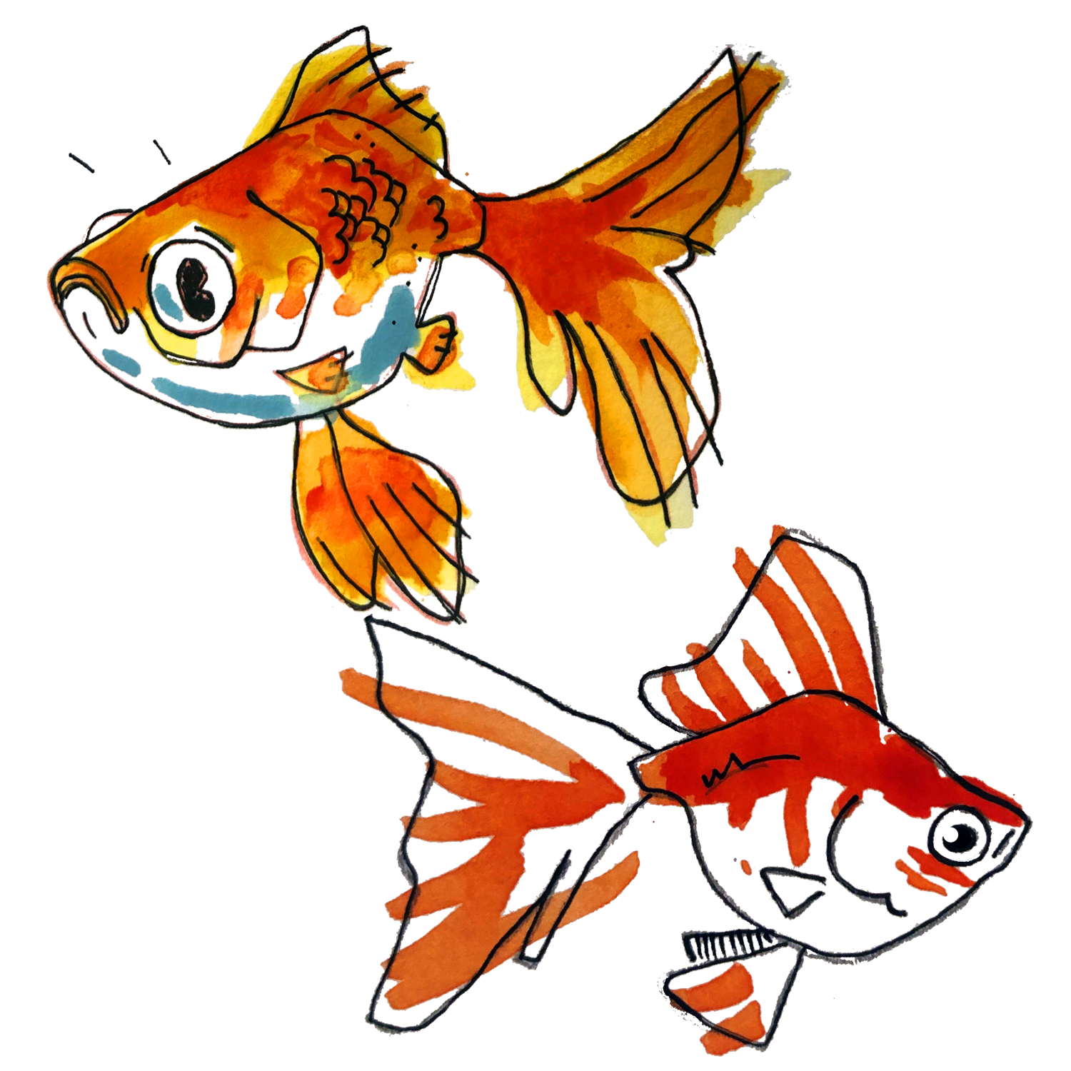
Below, a gallery of broken dreams.

AVT 667-Watercolor

There was a time when I despised watercolor.  I certainly admired watercolor works by others, but for an artist as self-conscious and prone to insecurity as I can be, the lack of control it affords I found to be infuriating.  I have enough trouble accepting the mistakes I make myself, I don’t need watercolor doing its own thing all over my canvas in an act of willful defiance.  As I’ve mellowed out (some) over time, I’ve come to realize that the spontaneity and unpredictable nature of watercolor is a feature, not a bug.  You can build your skillset, exact meticulous levels of control, and implement all sorts of tricks with the aim of purposefully manipulating the pigment, but in the end, there’s always going to be some reaction you didn’t intend.  You’ll always be surprised.  This is great if you’re open to it, but some students may bristle and grow frustrated by their perceived lack of agency in the artmaking process. 

This blog represents the writing I’ve done for several classes in the MAT program, and as such, watercolor is something I have covered in detail previously.  To avoid repeating myself, for this entry I’ll focus on the things I’ve picked up over time, and that are worth considering in a teaching setting. 

-Materials matter.  Low-cost Crayola brand watercolor paints have their appeal, but I didn’t truly start to appreciate the medium until I invested in higher quality paints and brushes.  The really cheap stuff feels like painting with Pixie Sticks diluted in water: Grainy and dull.  Artist (or professional) grade watercolors are vivid and much more reactive to water and brushes.   

-While I don’t really have a preference between watercolor cakes, pans, or tubes, I think the tube paints are easier to mix on a palette, and I had a weird, psychological hurdle to get over when “contaminating” colors in the pans.  Not a big deal at all, but something to keep in mind. 

-TAPE YOUR PAPER DOWN, and tape it well.  Watercolor paper, when dry, feels so thick and sturdy that affixing it securely to a board or surface doesn’t seem all that important.  Over time, as that thing gets wet and starts to warp into shapes you didn’t think it capable of, you’ll regret not taking this step more seriously.  I’d always used painter’s tape to prepare my surface, but it was low tack and wouldn’t hold for long.  If the tape came loose, I didn’t sweat it.  This was a mistake.  If the paper buckles, your options for paint strokes become limited.  Save yourself the headache and tape it down firmly from the outset.  It’s hard to straighten the paper out again once its mutation is underway.   

-Pay attention to the incline of the surface you’re working on.  I tend to work at a drafting table, which is angled, and causes water to run downward.  This is fine if it’s done with intent, but causes problems when not.  Work flat at first, and start to tilt the paper around to make the runny, water aspect of watercolor work for you.  Lead the pigment towards where you want it to go. 

-Have students spend ample time practicing wet on dry and wet on wet techniques.  With watercolor being unwieldy, giving them every tool to mitigate that feeling and regain a sense of control is invaluable. 

-Start working on abstract projects at first, laying down colors, experimenting with brushstrokes and various effects, as opposed to jumping straight into something representational (like a still life).  It’ll help lessen the learning curve (and blow to your ego) if you start with figuring out the things you can easily do with watercolor as opposed to the things you can’t.

AVT 667-Acrylic

Unlike tempera, acrylic paint is thick in consistency, easy to apply to a surface, and intuitive in use.  As mentioned in my last entry, I find it to be a more welcoming entry into painting than tempera, and those who work with it often will naturally pick up transferrable skills that will be beneficial should they eventually make forays into oil painting.  Mixing colors is relatively easy, as are experiments in layers and washes due to acrylic’s inclination to dry quickly.  Drying speed is a boon to teachers as well, in that wet paintings don’t have to be safely stored for days.  If cleanup procedures are begun with a good 10-15 minutes of class time remaining, chances are students will be able to take their pieces home or store them in a folder or flat file (assuming they didn’t apply the paint too liberally).   

Cheap, low-quality brushes can easily be used for acrylic painting projects in an elementary school setting, but if the budget allows for it, it’s worth providing a wide range of brush sizes and shapes for students to play around with.  Acrylic paint leaves a thick, distinct mark on paper or canvas, having multiple brush types allows students to really lean into the possibilities for expressive mark making.  

As it is latex based, this paint will apply to practically any surface.  If materials are available, I think it’s worth encouraging students to try painting on a variety of surfaces and expand their concepts of how and where art can be made.  A simple project example would be to have them paint on a glass window that receives ample sunlight.  This will quickly teach them lessons about opacity, as they must manipulate the thickness of the paint to control how much or little light they want to show through.  Again, because of its latex nature it would not be overly difficult for the teacher to clean the windows at the end of a term, as the paint can be scraped off with little effort.   

Given the time I’d gladly play around with acrylic paint for hours.  Because of constraints inherent to our classroom setting, this go round I simply doodled a monkey eating french fries.  Is this a searing commentary on globalized consumerism encroaching on the natural environment, or the juvenile musings of a simpleton with a weird sense of humor?  You’ll find no answers here, I let my art speak for itself.